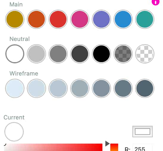
Synchronized swatches
Non-sync’d swatch
Sparkle adopts a unified palette across the entire website, the color picker is a swatch of colors that can be used anywhere a color is needed: text, backgrounds, fills, shadows, borders, etc.
The purpose of the swatches is to help in maintaining color consistency across elements and pages. Each color swatch contains a color value, and when that’s changed, all elements using the color in all pages will change.
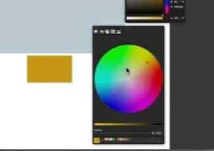
For example the page background color picker:
Dark Mode
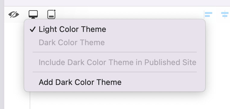
You can allow for your website to automatically switch to dark mode, for devices that support it, by adding a dark color theme. When you select “Add Dark Color Theme” from the format bar popup, a second color is added to each swatch, and you can view it by using the toggle in the top-left of the color picker popup.
The same popup lets you switch to and from dark mode, to preview the difference in canvas, and include or exclude the dark color theme from the published website, while it’s a work in progress.
It is important to note that if for example you have picked the swatch containing the red color for the background of a box, you don’t pick a different swatch in dark mode, rather you change the color values for the same swatch. Changing the swatch while viewing the dark color theme would change the light mode color as well.
Once complete and published, the visitor’s browser will show the color theme as determined by their system.
For other content changes in dark mode, see the color theme-based visibility, in the Arrange inspector.
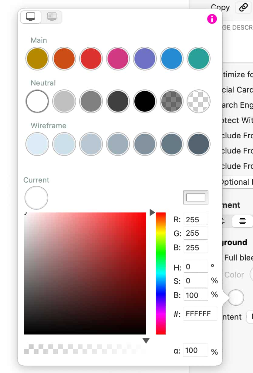
Operating the color picker
An outline identifies the currently selected color swatch. The color value can be changed by selecting it on the brightness/saturation and hue sliders, or entering red/green/blue, hue/saturation/brightness or “web color” hexadecimal values.
There’s a system color well on the right side below the swatches, to access your system color picker’s palette or to sample an on-screen color.
For the purpose of maintaining a consistent color scheme across the entire site, all swatches in Sparkle are synchronized across elements. In other words, when you change the color value of a swatch, all elements that use it will change to that color. The exception to this is the “current” swatch, which is not synchronized.
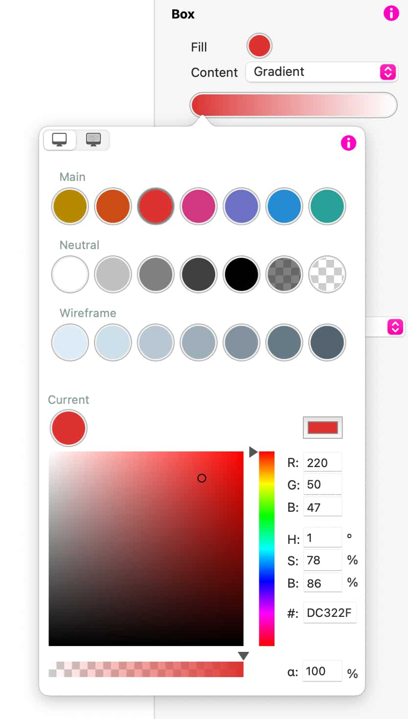
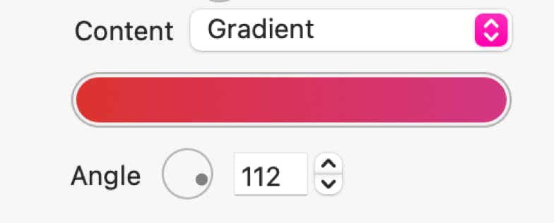
Finally the color picker for the box element lets you select a gradient, by setting the two ends of the gradient separately.
Gradients can be oriented in any direction via the gradient angle control.
Please report any shortcoming in this documentation and we’ll fix it as soon as possible!
Updated for Sparkle 5.2
This website makes use of cookies.
Please see our privacy policy for details.
It’s Okay
Deny