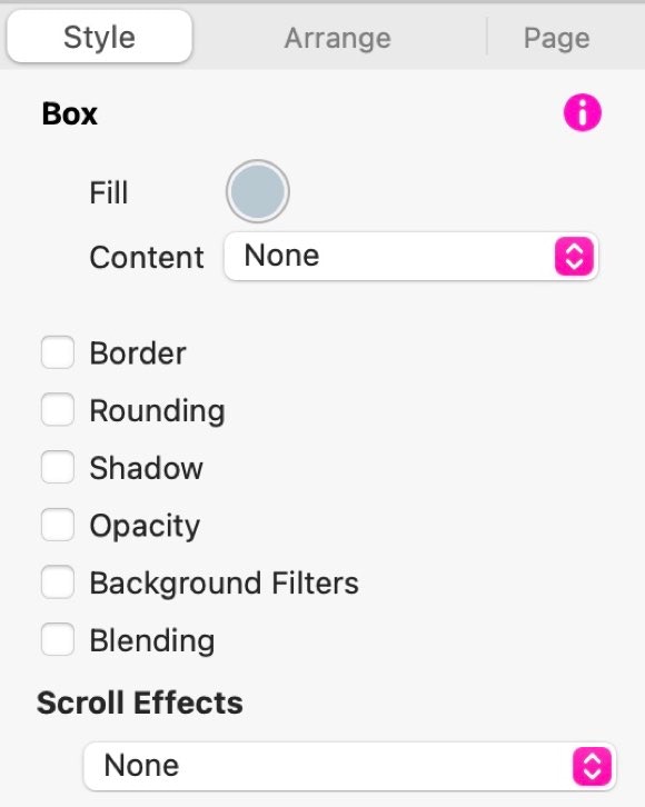
When we think of boxes, we tend to think of those square or oblong shapes that we use to separate content on the web page. But, there is more to boxes than first meets the eye. They are one of the essential building blocks of web design and when used creatively, offer you great flexibility in setting out the message of your web page. Take a look at the example page header below. It’s made almost entirely of boxes. Some with rounded corners, some filled with images, some with solid colour and overlaid with text and a couple with just icons.
In Sparkle, you have all the styling tools you could wish for when it comes to boxes, and all of them are conveniently located in the Style panel on the right of Sparkle’s interface.
Thai Delights
Authentic Asian Dining Experience
Lorem ipsum dolor sit amet, consectetur adipiscing elit. Aliquam tincidunt lorem enim, eget fringilla turpis congue vitae. Phasellus aliquam nisi ut lorem vestibulum eleifend. Nulla ut arcu non nisi congue venenatis vitae ut ante. Nam iaculis sem nec ultrices
Button
Button


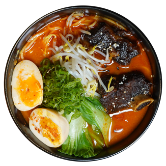
Check Out Our Menu
Two types of Boxes
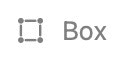
The first type of box is the straightforward standard box - it looks like this:
The second type of box is the Wide box, which looks like this:
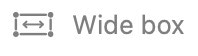
The standard box is designed for creating boxes that remain within the left and right margins of your web page, whilst the wide box is designed to extend beyond the left and right borders of the page into the full browser width.
When a standard box is added to the canvas, it can be sized and positioned however you wish. Furthermore, the box can be styled to create just the effect you want. Here are the options available in the style panel.
The first option is the Fill. Here you can select a color with which to fill your box. You also have the option to create other fill types from the Content drop-down:
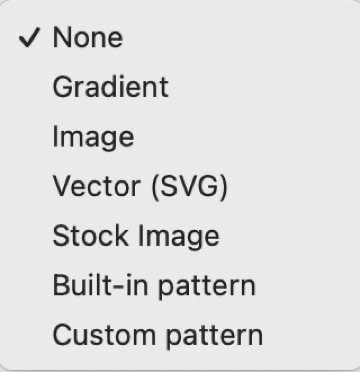
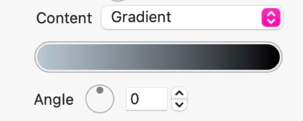
If you choose the Gradient option, you will be presented with a gradient color bar where you can select two colors, as well as an angle for the gradient. Just click on each end of the color bar to choose your colors, and then apply an angle
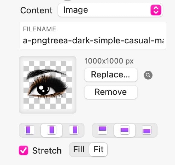
If you choose the image option, you can choose an image from your disk to fill your box. This will give you other options on whether to fill or fit the image within the box. Just select the Stretch checkbox and make your choice. Filling the box will enlarge the image so that it fills the entire box - this may cause some clipping of the image. If you choose to Fit the image, it will not be clipped - it will be enlarged/reduced in size so that the entire image fits inside the box. Depending on the aspect ratio of the image, this option may create a letterbox effect - creating space on either side or above and below the image. When you choose the fill option, you will also have the ability to align the image within the box - either left, right or centred, or top, bottom or middle.
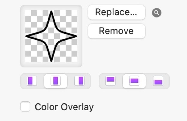
The SVG option is a great one for web designers. These are Scalable Vector Graphics that can be placed at any size on the canvas, whilst retaining their sharpness regardless of the degree of enlargement. We used SVG graphics in the example page header above. The three star icons are actually the same icon, duplicated and placed on the page at different sizes.The actual icon looks like this.
Notice that it’s black. This highlights another advantage of using SVG graphics. You can change the color/shade of the graphic by using the color overlay option in the style panel. Checking this option will allow you to select a color and apply it to the SVG. Note: The SVG doesn’t have to be contained within a box for this option to work - you can simply drag the SVG onto the canvas where it will be placed as an image, rather than a box.
The Stock Image option works in exactly the same way as the normal image option. The only difference is that you would select an image from one of the stock image libraries supported by Sparkle. Once your box is filled with an image, all the same styling options will be available.
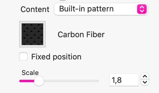
Built-in and Custom pattern options will fill your box with one of the many pattern fills offered by Sparkle. These patterns work in exactly the same way as when used as a page background fill. You can adjust the scale of the pattern to best suit your design.
Styling your boxes.
Regardless of how you choose to fill your boxes, you can add additional styling options.
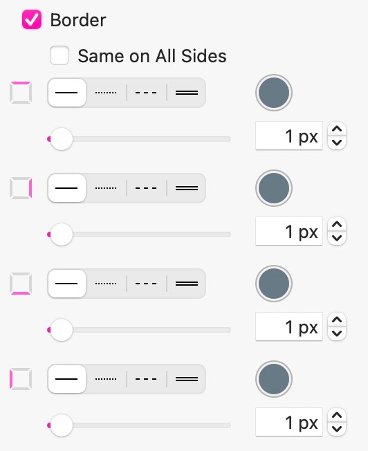
Border: Selecting this option allows you to apply a border to your box. You can set the border to be the same on all sides, or have a different style/thickness/color of border on each side of your box.
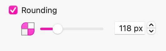
Rounding: This option adds corner rounding to your box. You can select to round all four corners identically, or selectively choose how and which corners get rounded. If the box is a perfect square, adding corner rounding to all four corners can turn your box into a circle.
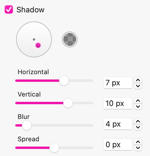
Shadow: This option adds a shadow to your box. Adjustment to the effect can be done by moving the small dot around within the circle, or more precisely, by entering actual dimensions. The shadow color can be changed by clicking on the color well.
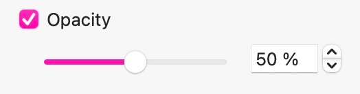
Opacity: This is where you can reduce the opacity of your box. Although you could simply change the colour of your box to create a lighter shade of color, the opacity option may be preferable when creating certain types of effect where the underlying elements of the page need to show through the box.
Background Filters: These filters determine what happens when there are other page elements BEHIND your box. Whilst the opacity option allows underlying objects to show through your box, background filters add a degree of distortion to the background elements. For example, by placing a completely transparent or partially transparent box over a background element, and then applying a blur background filter, the effect resembles that of a frosted glass box floating over the background. Effects like this are particularly effective if your box has a scroll animation applied to it. As the page scrolls, your box could float over other page elements , giving a more three dimensional effect to the page.
Because boxes are really simple to create, they are the ideal element to use when fist setting out your web page layout (wire framing). They can emulate images, background areas, buttons and form fields to give you a quick overview of how your page will look. Once you’ve got your basic wire frame design and start working on your content for real, it would be nice to be able to convert your boxes into some of the more common elements without having to start from scratch. Don’t worry, Sparkle has you covered. You can right-click on a box and choose one of the convert options from the context menu.
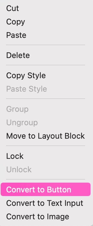
The context menu also has another helpful feature that allows you to copy a style that has been applied to an object, and then paste that style to another object. For example, you could style a button on your page, complete with its hover and clicked states. When you want to add another button further down the page, you can copy the style of the original button, then paste the style to the new button. This keeps your designs consistent throughout your page.
Please report any shortcoming in this documentation and we’ll fix it as soon as possible!
Updated for Sparkle 5.5
This website makes use of cookies.
Please see our privacy policy for details.
It’s Okay
Deny